Nitty-Gritty: Relative Stability and Density
Published in Chapter 6, 2021
This analysis classifies places in terms of population stability and density using quartiles and outliers. It does so by sorting all values into three main categories (low, average, high), with two additional categories for very low and very high cases (based on Tukey fences as used in Chapter 3). This is done because the continuous measures are spread across different ranges due to the differing spatial unit resolutions of the census throughout time and therefore, cannot be compared directly. Labels of high, average and low area used to compare places over different decades. Average values are defined as those within the interquartile range – otherwise stated, the range that contains fifty percent of the data that falls between the 25th and 75th percentile. The virtue of this approach is that it allows for a data-driven, yet simple and clear and most importantly comparable understanding of what is low or high. ‘Low’ denotes values that are lower than half of the observations; in the same spirit, ‘high’ denotes values that are higher than fifty percent of the data.
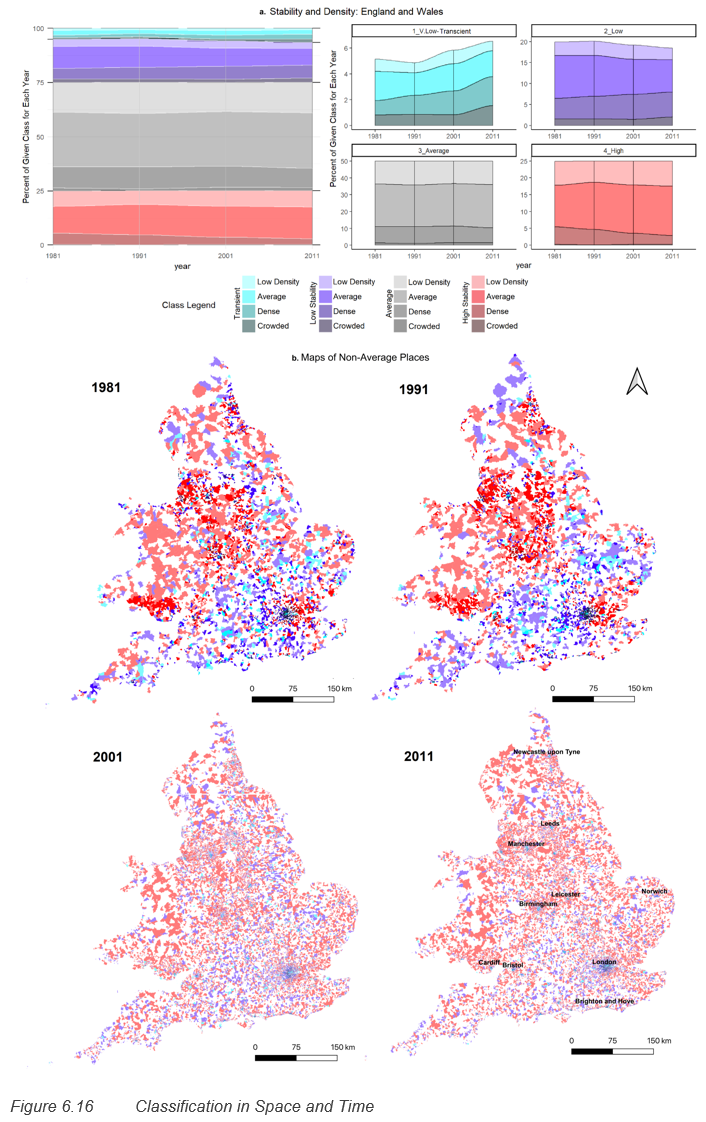
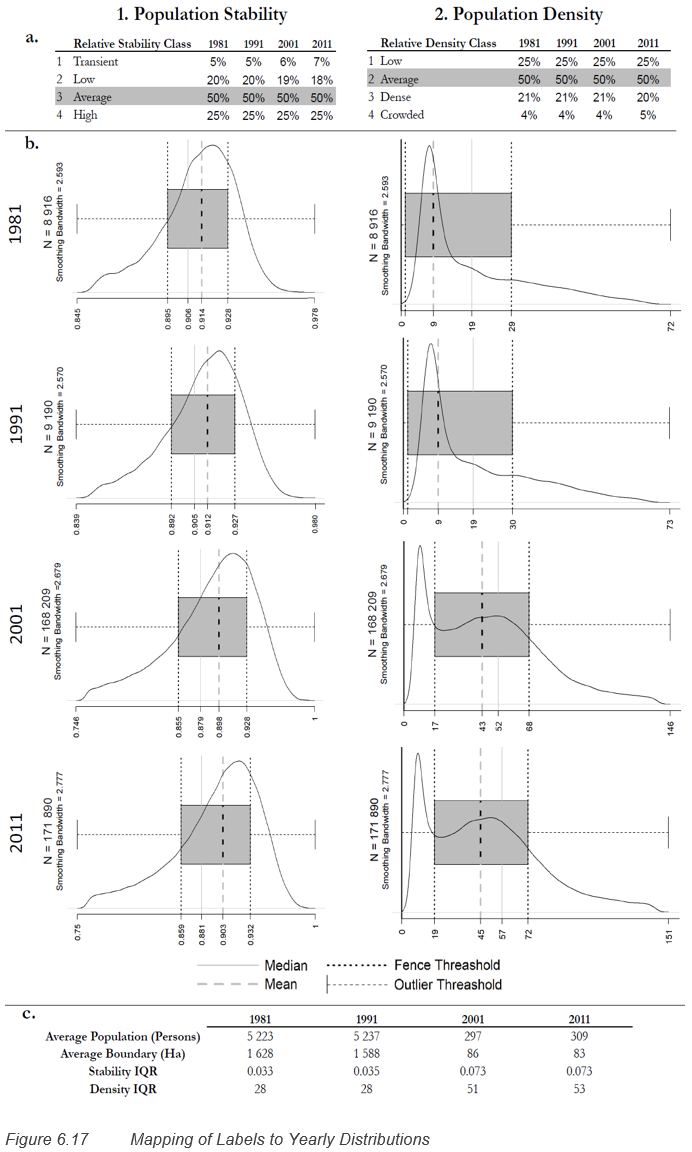
Figure 6.16 (a) shows how small areas are classified in time such that 50% (shown in grey) of places set the expectation for what is ‘average’ population stability. In red are places that are more stable than usual. By contrast the different values of blue denote places that are less stable (purple) or exceptionally transient (cyan). Population density is assigned in the same way and is shown in Figure 6.16 (a) as darker shades on the stability colours. Figure 6.16 shows that the distribution of population stability has become more skewed over time because there is an increase of exceptionally transient places (the percentage increase in shown in Figure 6.17(1a)). More importantly Figure 6.16 shows that for all years, and increasingly in the later years, low stability is associated with higher densities. Figure 6.16 (b) shows the prevalence of low stability and transient places in the South, under the diagonal formed by Bristol, Birmingham and Leeds with London being a clear epicentre.
Figure 6.17 provides a breakdown of the classification cut-offs per year superimposed on a smoothed density plot of non-outlier values. The outlier definition used is discussed in section 6.6.2.1 and the percentage of these by year is shown in the table of Figure 6.17 (a). Again, grey areas denote values which cover 50% of the total data for that year. At either end, the notches show the thresholds for low values on the left, and high values on the right. The density curve shows the underlying yearly data distribution for both the stability and density metric.
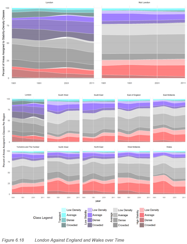
As expected, based on previous studies discussed in section 6.2, Figure 6.16 shows a clear difference between places in the North and those in the South, despite the variation in spatial scales as shown in Figure 6.17. Figure 6.18 shows the extent of this by examining stability and density by region. It shows that in the North, transient and low stability places are less prevalent. Despite yearly fluctuations, the proportion of unusually high stability places is on average highest across all time periods in Wales, the North East and the North West. The West Midland is the only region to show a clear consistent decline in high stability places. Yorkshire the Humber by contrast, is the only region to show a mild consistent increase places with high stability.


